← All workCase study 02 / 03
Mobile app redesignGAP France.
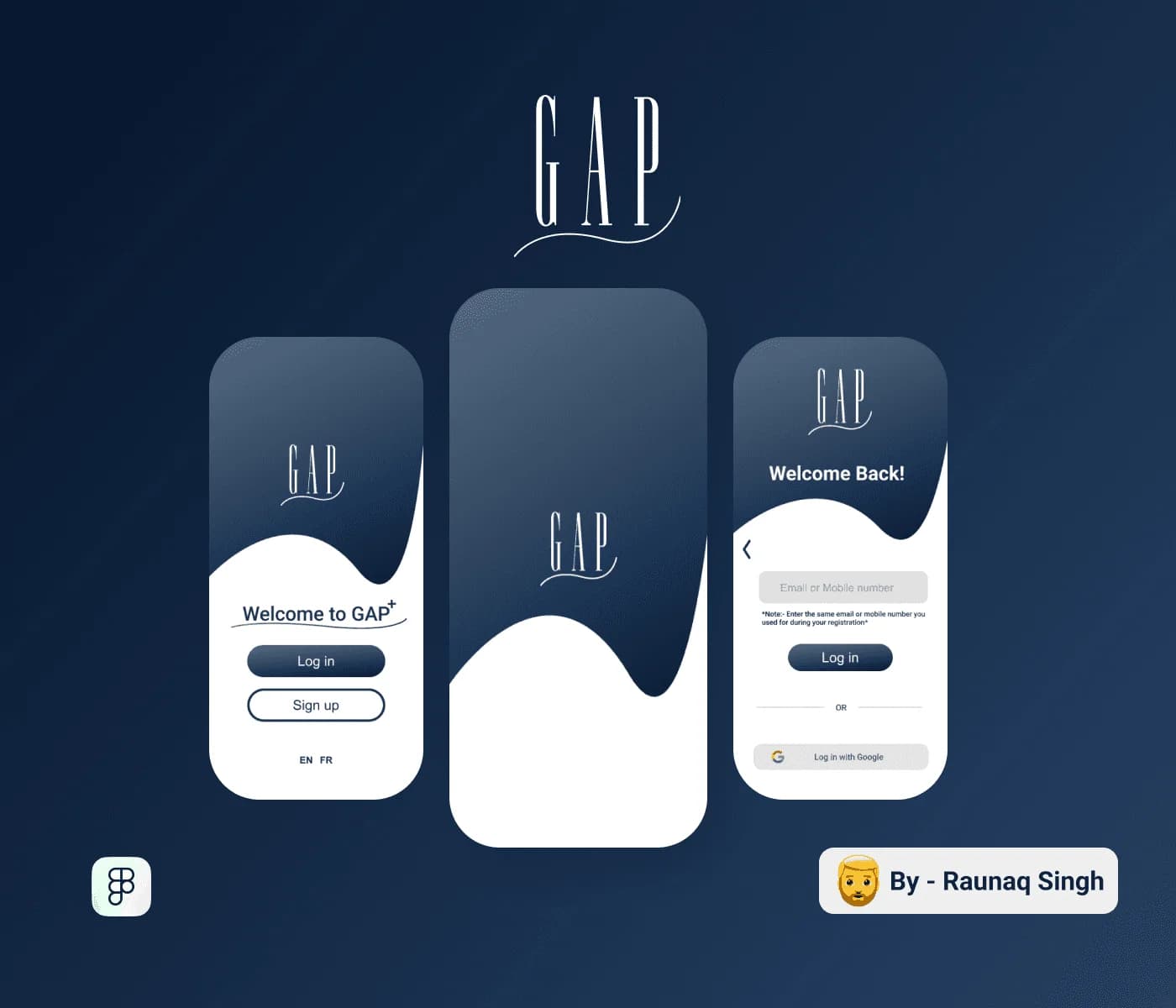
An independent UX/UI project I took up to fix the entire app layout, making it much more user friendly, providing an ease of access for the users.
01The Challenge
The GAP France mobile app had a layout that was hard to use, with poor ease of access for users.
02The Execution
An independent UX/UI project: I redesigned the entire app layout in Figma and Framer, focusing on usability and ease of access.
03The Impact
New user sign-ups rose by 50% after the app revamp (from my CV).
My role
- Independent UX/UI project
- Full app layout redesign
- Usability and ease of access
Deliverables
Mobile app interfaceRedesigned app layout
Full case study
The complete process and all project imagery live on Behance.
View on Behance (opens in a new tab)More work · use the ← → keys, Esc to go back